YES3 Dashboard
 |
Funding Source: NIH P30AG021342-19S1 |
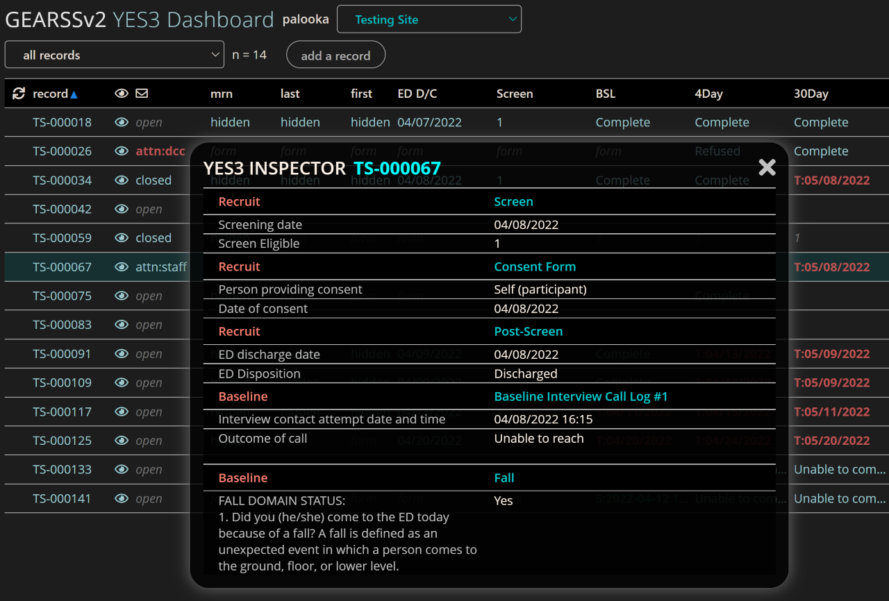
Below is a screenshot of the YES3 Dashboard. We refactored and extended the features of the Dashboard, based on feedback from our end-users. We are currently using the YES3 Dashboard on studies with different designs before public release to the REDCap Consortium. The purpose of the Dashboard is to organize REDCap features in a way that optimizes workflow efficiencies, thereby reducing operations costs.
Click here to view a brief introductory video about the YES3 Dashboard!
Sneak Peek
Features:
- Suitable for single-site as well as large multisite studies
- Tools to quickly navigate and access information
- User-defined sortable columns
- Color-coded contents can be adapted to study-specific statuses (e.g., target date, scheduled date, completion date+outcome).
- Column entries link directly to REDCap forms for easy access.
- Filters based on user-defined milestones (screened, eligible, enrolled, completed study, withdrawn etc).
- Dashboard remains open during data collection / data entry.
- Flexible record ID generator that can combine site abbreviations with either sequential or Luhn numbers (i.e. self-validating “check” digits).
- A pop-up “record inspector” that displays a user-configured overview of a participant’s progess through the study [see screenshot].
- A record-level communication tool for study staff to identify and resolve issues.
- A “safety” mode in which data elements tagged as PHI are hidden from display on the Dashboard.
Screenshot of Beta Version of YES3 Dashboard:

